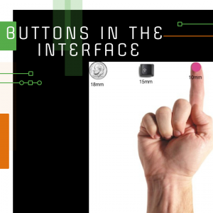
Buttons are one of the most famous interactive user interface elements. They play a very important role in organizing interaction with the user and the formation of a positive experience. Continuing a series of posts on UI / UX design topics, this article has collected concepts and examples regarding the most commonly used types of buttons found on websites and mobile applications.
WHAT IS THE BUTTON IN THE INTERFACE?
This is an interactive object that allows you to get the desired response from the service/application after executing a specific command. In fact, the button is a control element that enables the user to directly communicate with the device and send the necessary commands to achieve certain goals, for example: send an email, buy some product, upload data to the registration form on the website, turn on the player, and also many other actions. One of the reasons for the popularity of buttons and their convenience for users is that they effectively simulate interaction with objects in the material world.

Modern user interface buttons are diverse and multifunctional. As a rule, they are an interactive zone that stands out from the rest of the objects, has a certain geometric shape, and is supported by a text explaining the action.
CALL-TO-ACTION
Its main task is to encourage users to perform certain actions, turning them from passive users to active ones. Such “activities” are most relevant in the design of landing pages and are associated, for example, with the purchase of goods, subscriptions to newsletters, etc.
Technically, a CTA button can be implemented in various ways, but it must be supported by text with a specific appeal. Its main difference from all the other buttons around is its ability to attract attention. It stands out on the page/screen and encourages users to perform the necessary actions.
TEXT BUTTON
Everything is very clear here – this is a button with specific text. Moreover, the word/phrase is not highlighted in any form, tab, or something similar, that is, visually the text does not resemble a button in the usual sense. Despite this, this control provides all the necessary features for interacting with the interface.
LISTING BUTTON
When you click on it, a drop-down list of mutually exclusive items is displayed. This option is often used to enter the “Settings” section. The selected item from the list is usually marked as active, for example, using color.
PLUS BUTTON
By clicking on it, the user will be able to add some content to the system. Depending on the type of application, it can be a new message, contact, location, note, the item from the list – all that are the basic actions for a digital device.
OPTION BUTTON
After clicking it, a set of available options opens – this is another way to set the desired type of interaction without overloading the screen, which is especially important for the design of mobile interfaces for devices with a small display size.

